ClimaWorld
MY ROLE - SOLE UX/UI DESIGNERDURATION - 12 WEEKSClimaWorld runs sweepstakes where users can win cash prizes for funding climate projects.
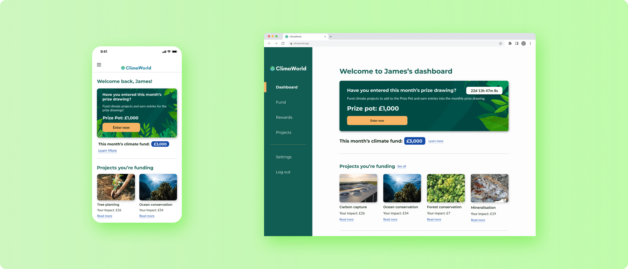
I designed a new homepage and web app from the ground up in preparation for ClimaWorld’s global launch.
PROBLEM SPACEWhat will attract more users to the website?
The ClimaWorld team, based in the UK, has spent a year conducting user research and market research. Now they are preparing to officially launch their product in the US and in many other countries around the globe. ClimaWorld’s primary business goal was to attract more paying users. To fulfill that goal, they needed help designing a new homepage and building a web app with a dashboard. Although I pushed for mobile-first design, ClimaWorld’s team wanted me to focus on designing for desktop instead.
COMPETITIVE ANALYSISWhat were companies doing right?
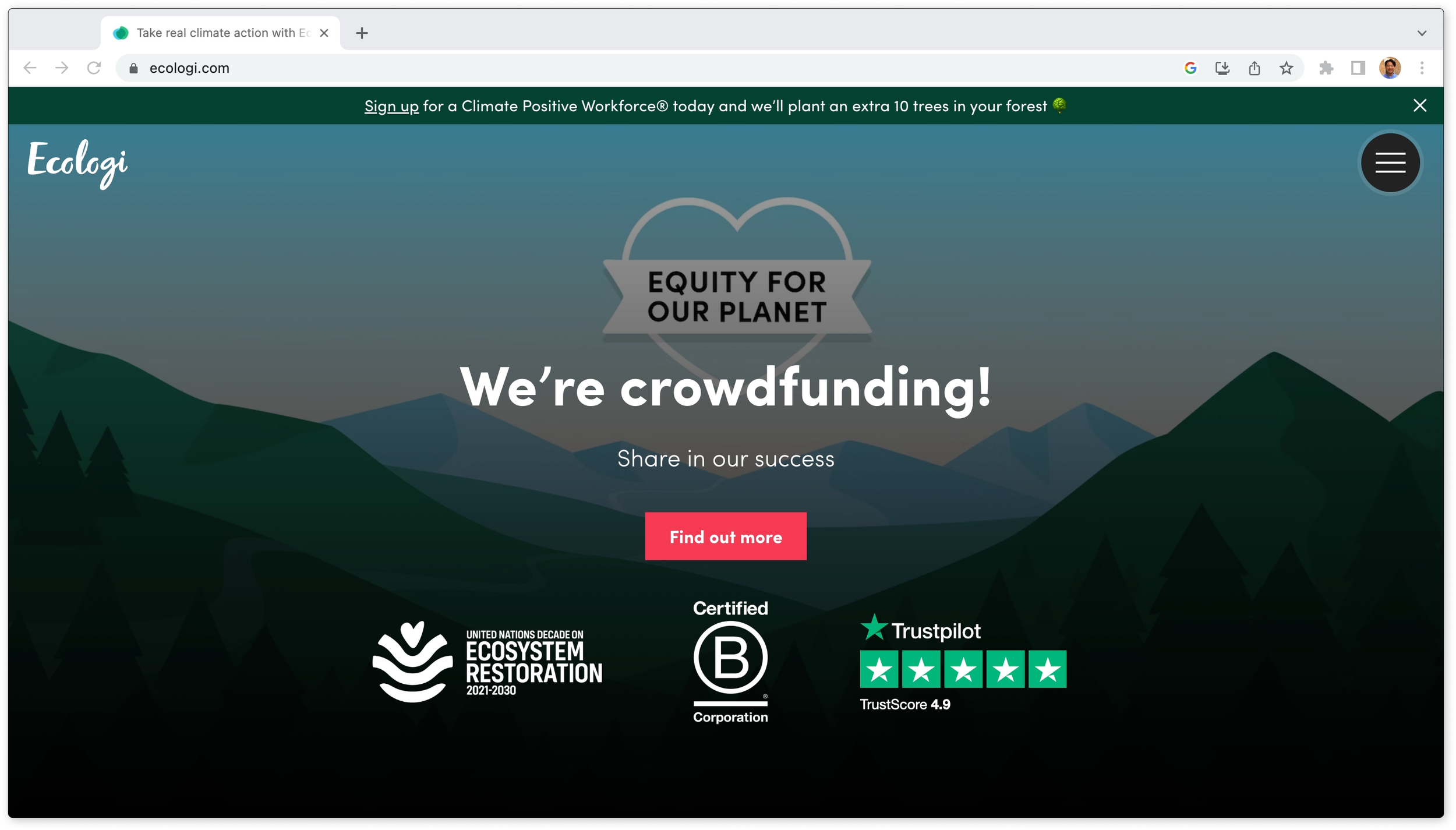
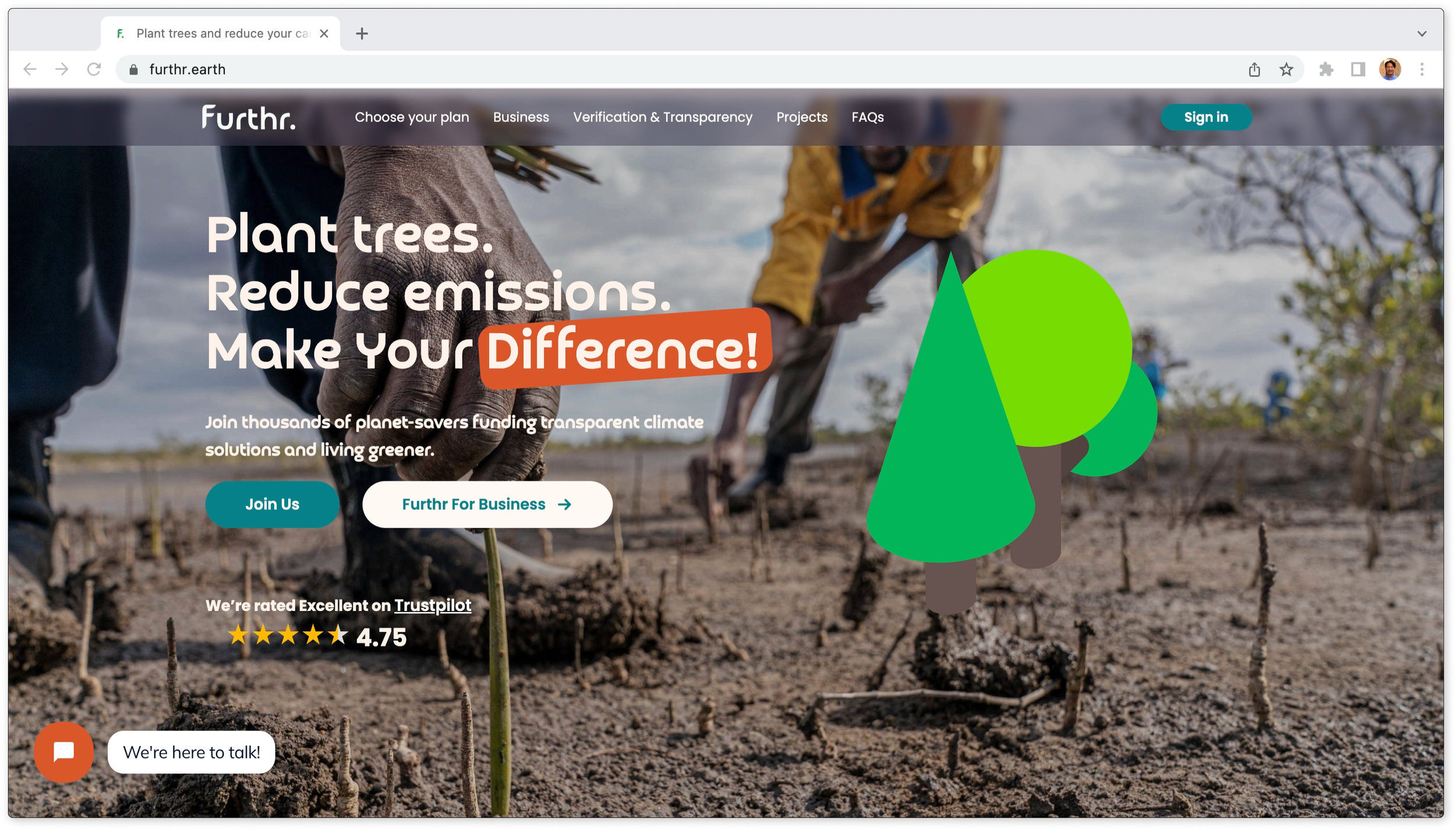
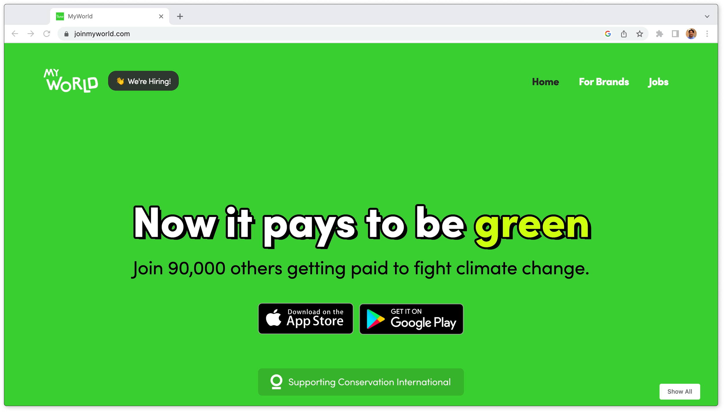
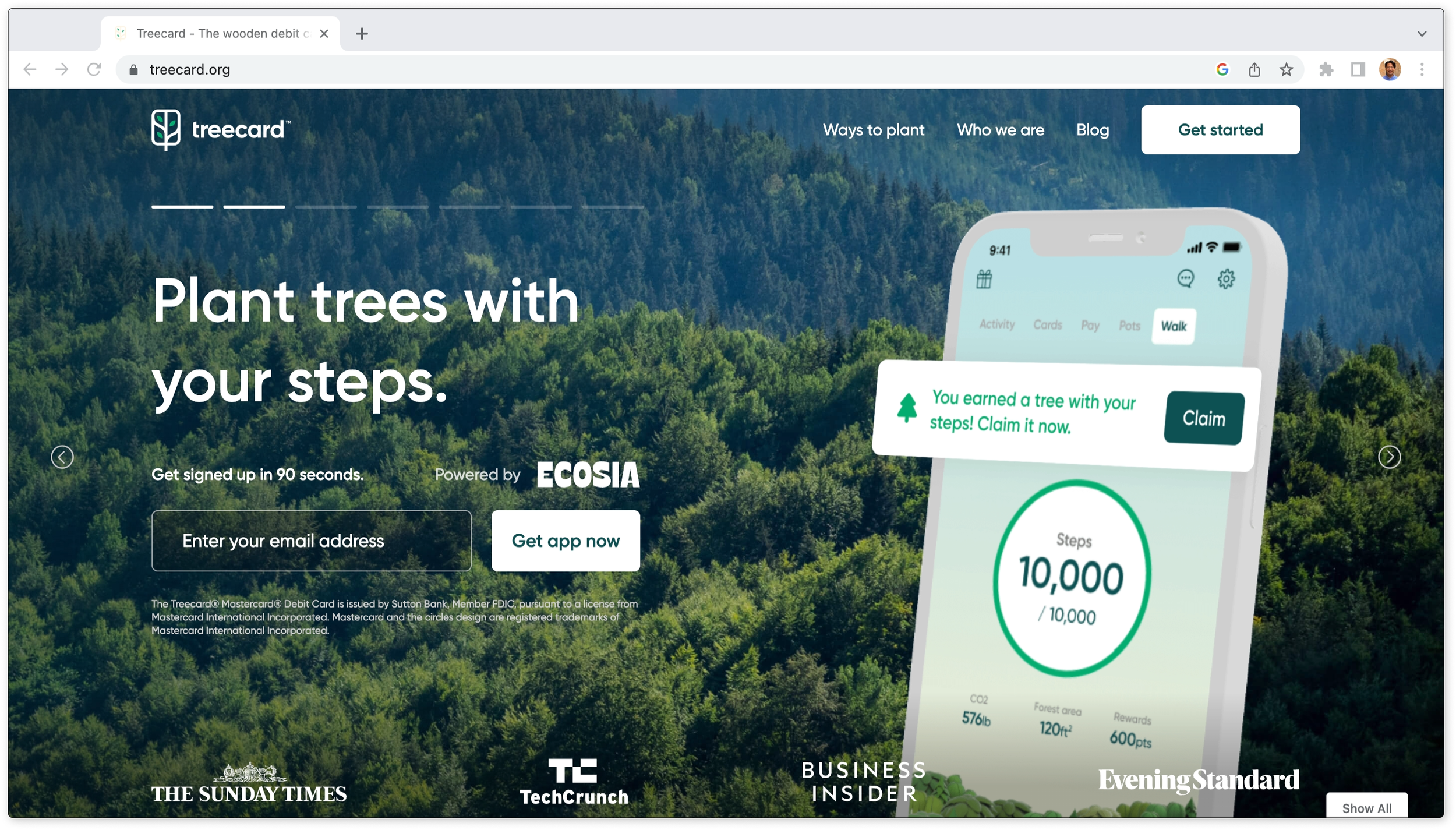
I conducted a competitive analysis of some competing products, Ecologi, Furthr, MyCard, and Treecard. I found that it’s important to not overload the user with text and instead communicate information through visuals, illustrations, and interactive interfaces. Also, CTA buttons should be clickable and appealing to the user and they should be contrasting colors so that the buttons stand out from other UI components.
INSIGHTSThe user flow needs to be intuitive and easy to navigate to attract and retain users.
Ideally, ClimaWorld users should be able to fund climate projects from anywhere in the web app in as few clicks as possible. I carefully structured the user flow to anticipate likely paths that users might take. Users who are impressed and satisfied with the ease of navigation will be more likely to keep coming back to ClimaWorld and recommending the site to other users.
ITERATIONSDashboard
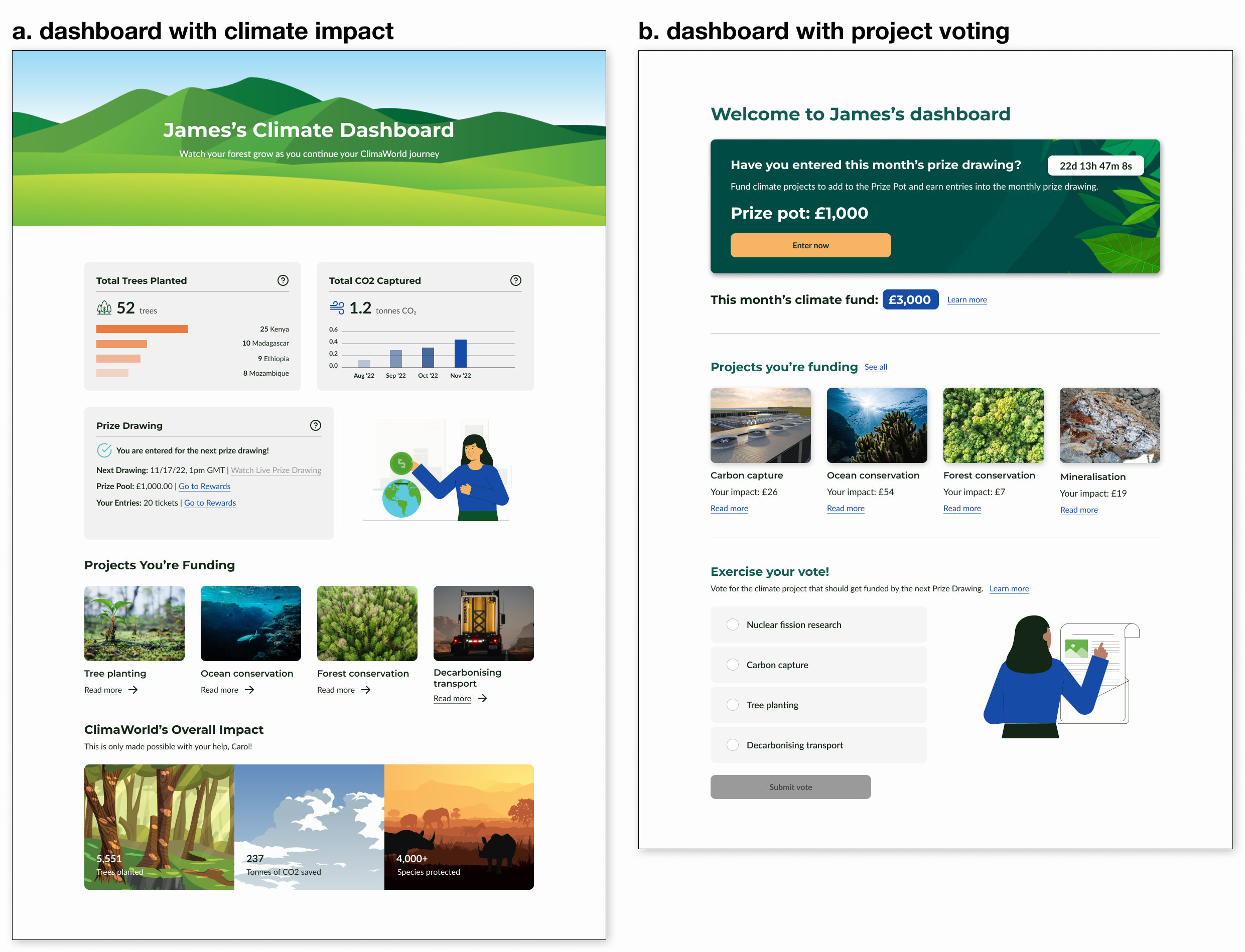
I decided to go with b. dashboard with project voting because having a vote feature is more interactive and increases user engagement which will lead to more returning users. Also, the prize draw card with a countdown and CTA button at the top of the page is more effective at getting users to donate to climate projects and enter prize draws.
Rewards
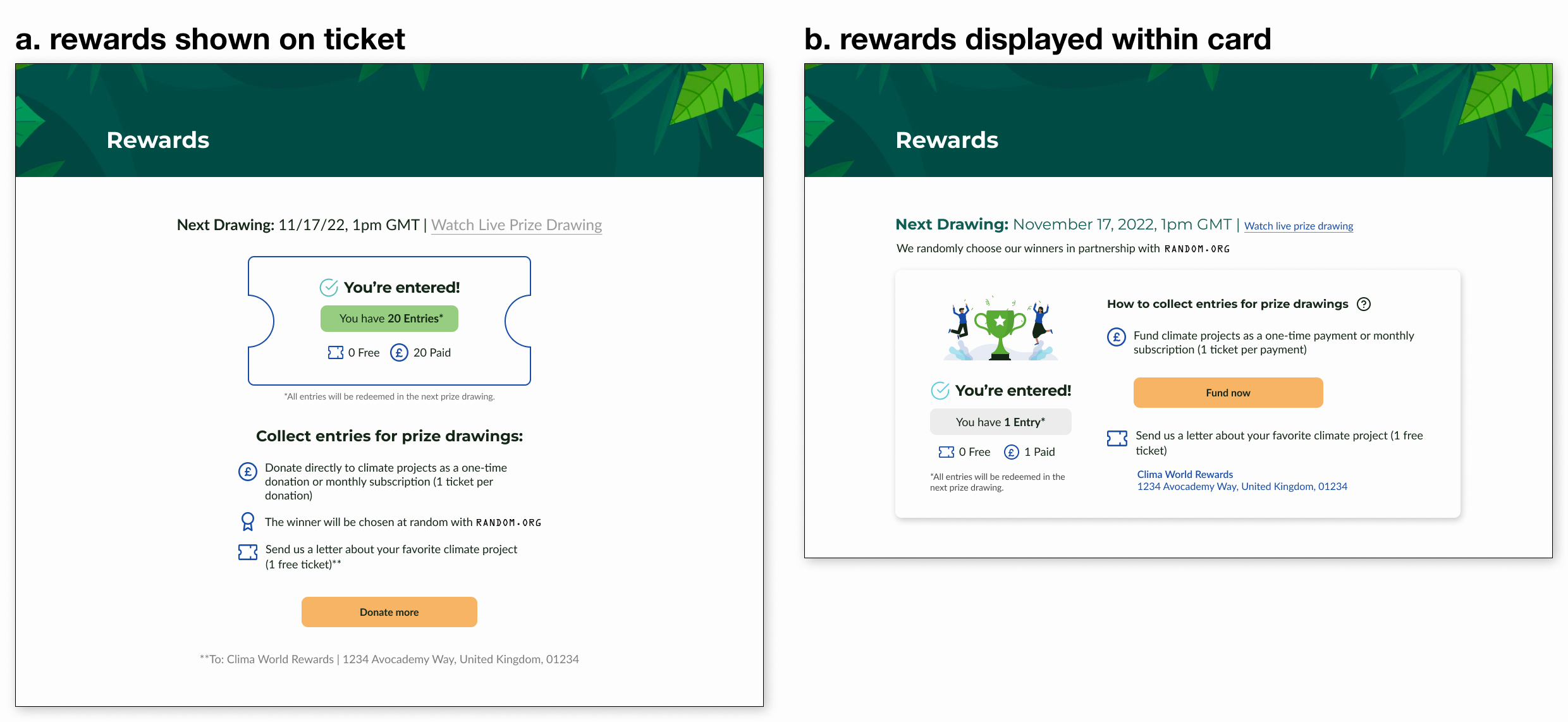
I went with b. rewards displayed within card because it displayed the rewards information better by simplifying the interface. Having everything in a simplified card design helps get rid of visual clutter and decreases cognitive load.
Donate
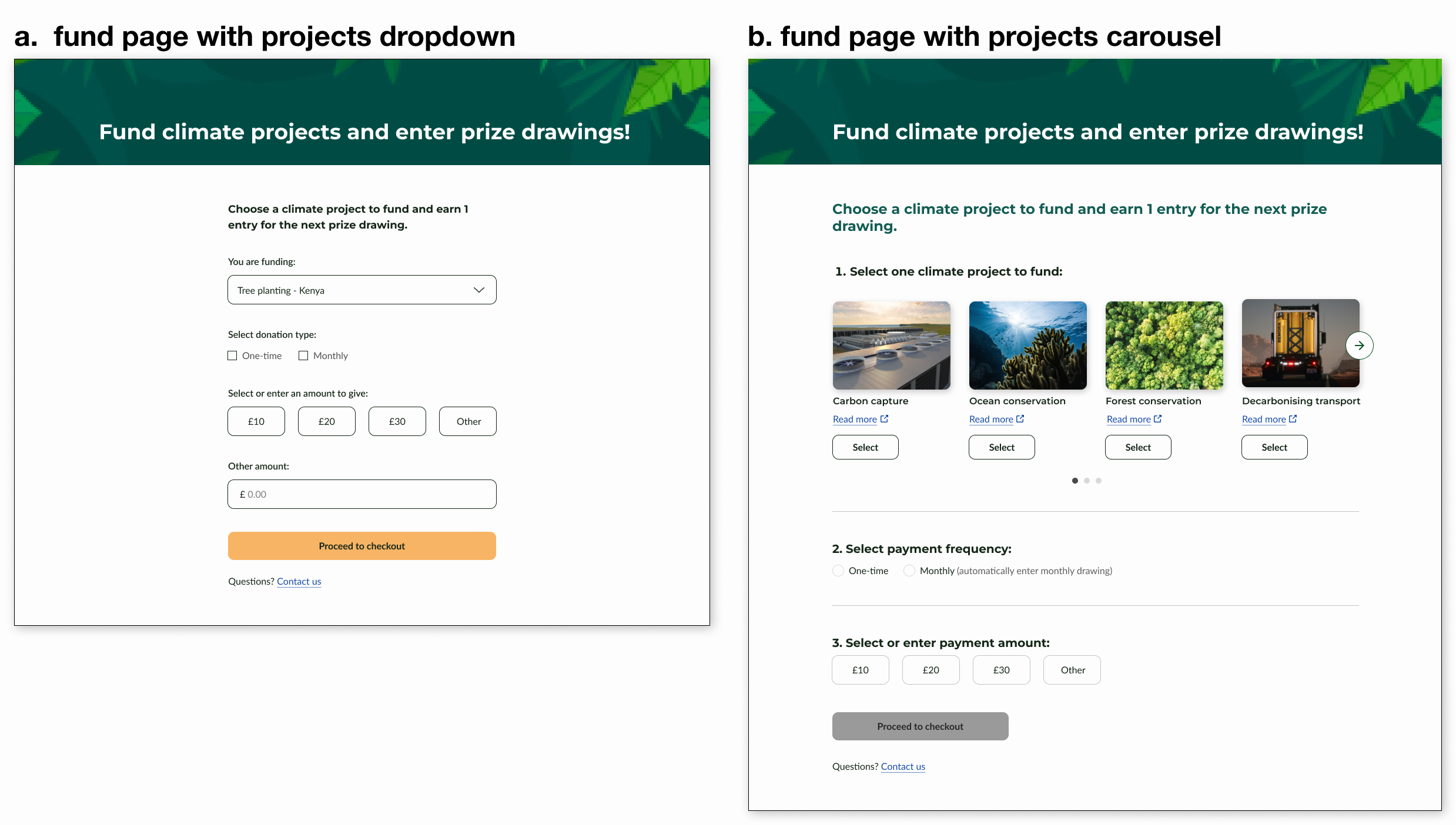
I chose b. fund page with projects carousel because a carousel was more effective in displaying all of the projects all at once than a dropdown in this situation. Users can see what each project looks like and click into project details before they make a decision on which one to fund.
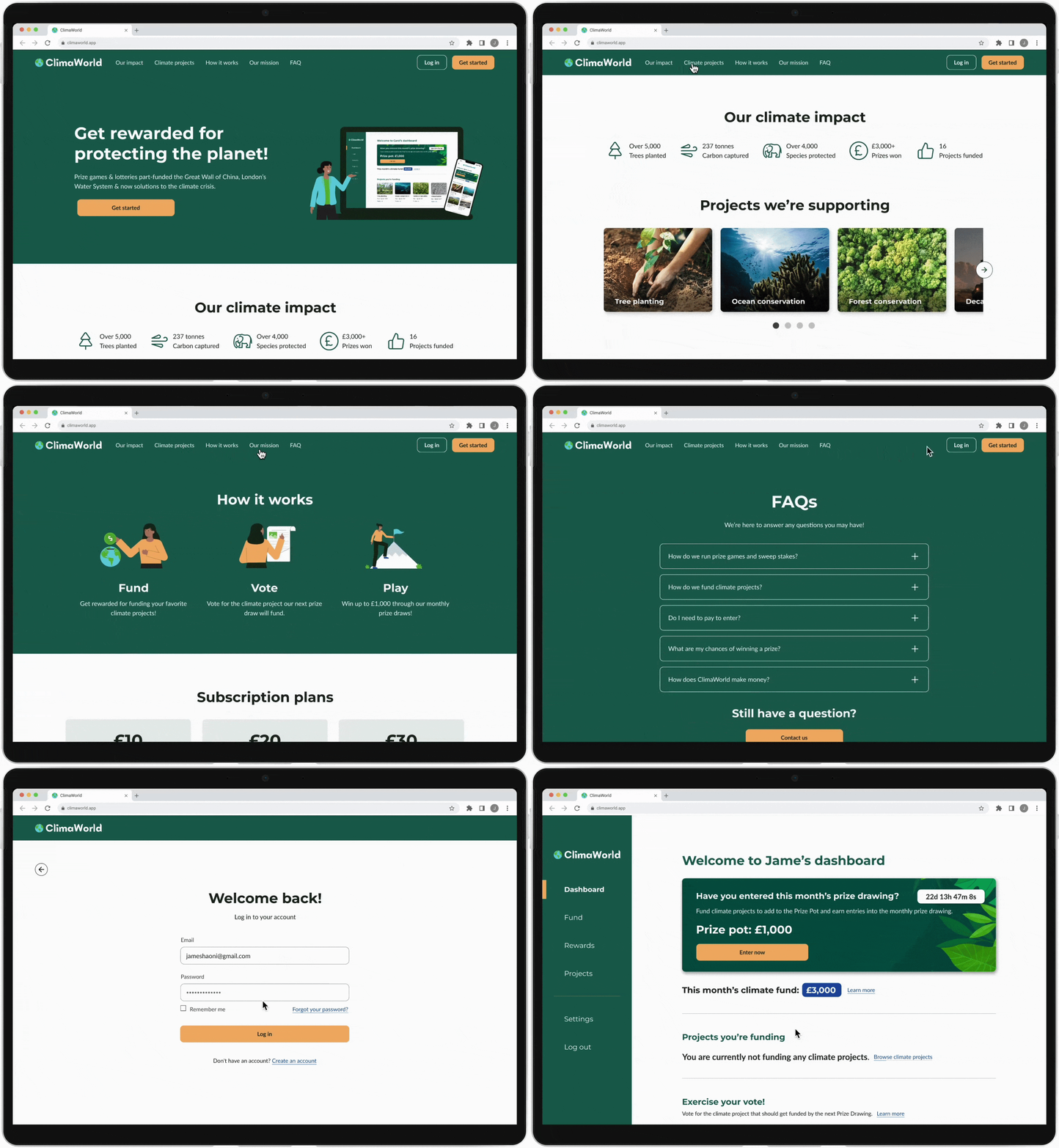
FINAL DESIGNHomepage & Log In
Users can easily navigate to different sections of the homepage and log in to the dashboard using the top nav bar.
Fund & Rewards
Enter now button takes users to the fund projects page. When users finish checking out they can either see their entries on the rewards page or go back to the dashboard.
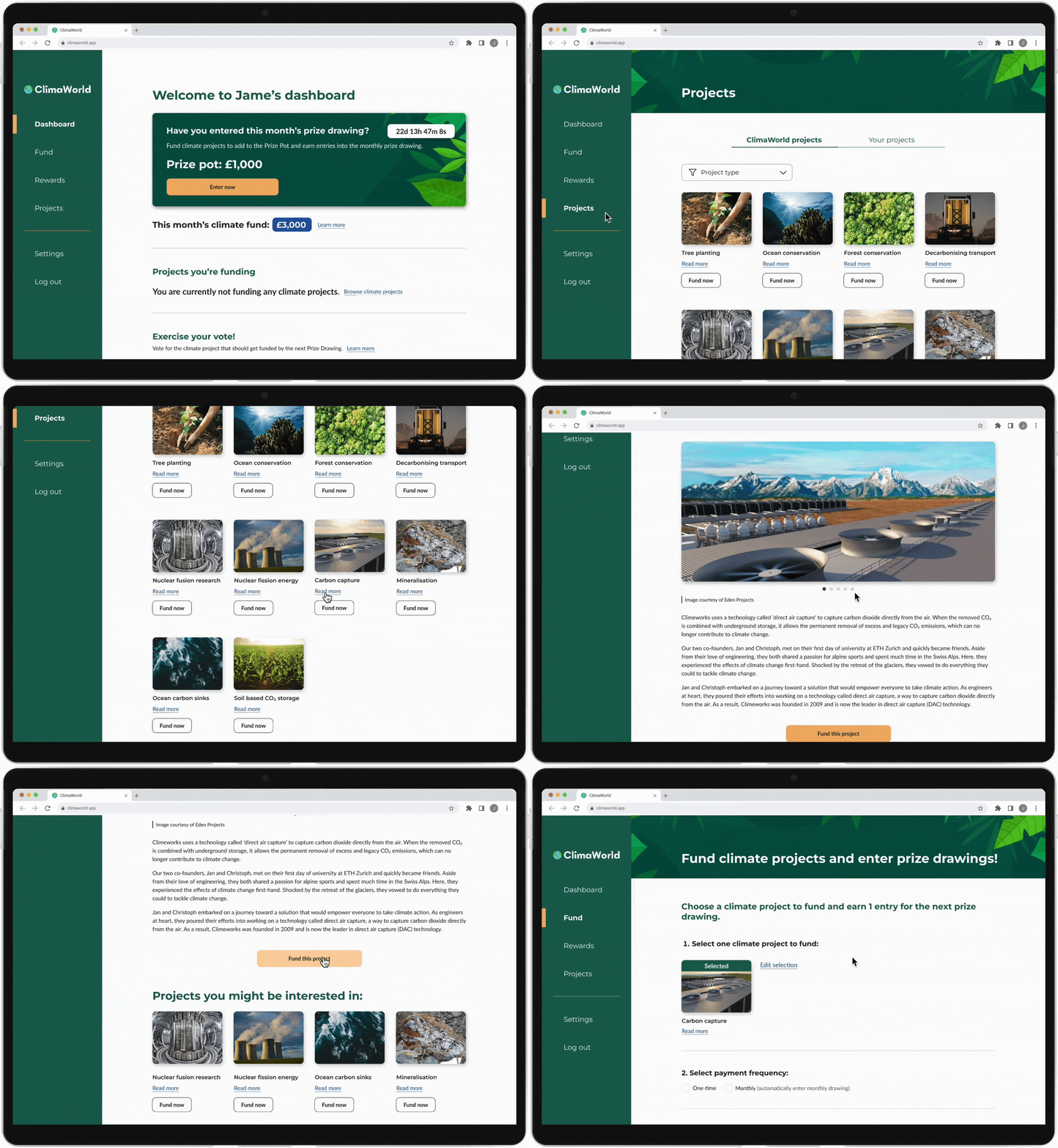
Project Details & Fund Project
Users can view all of the projects on the projects page. They can click into a specific project to see more details. Fund this project button takes users directly to the fund page.
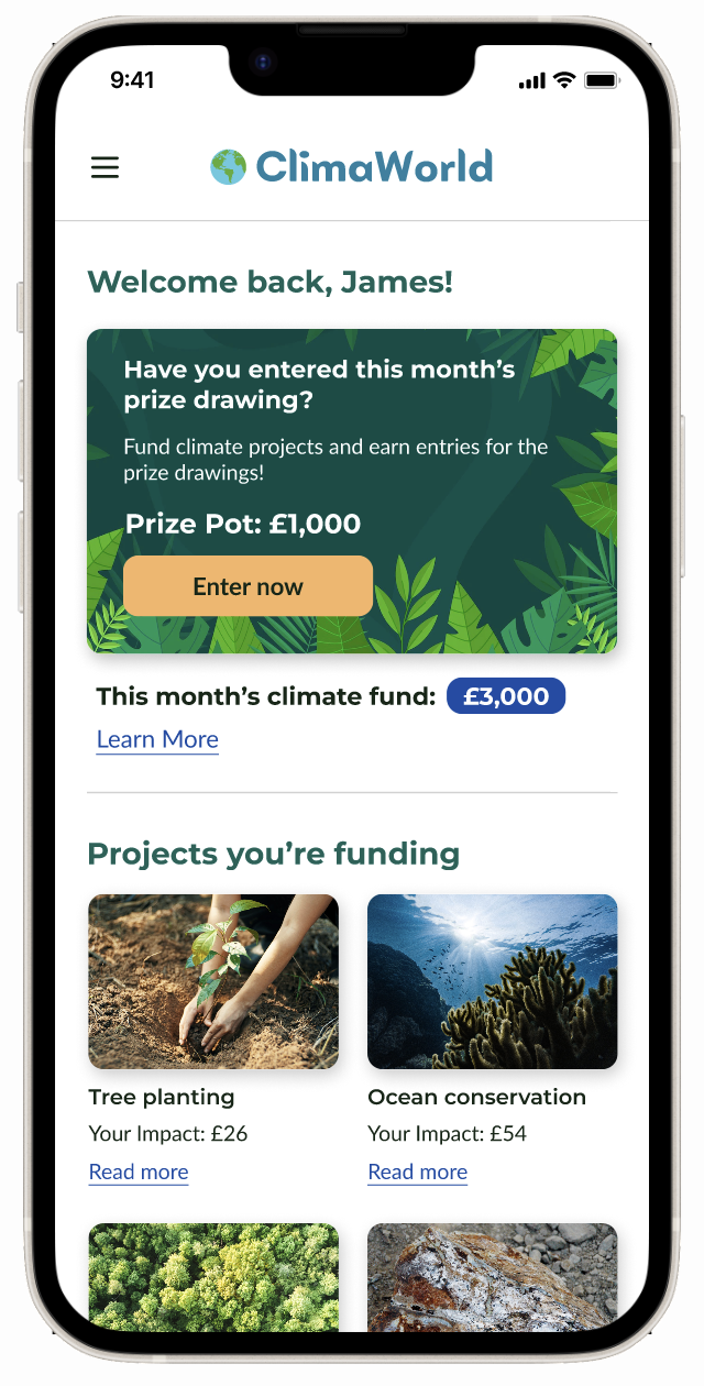
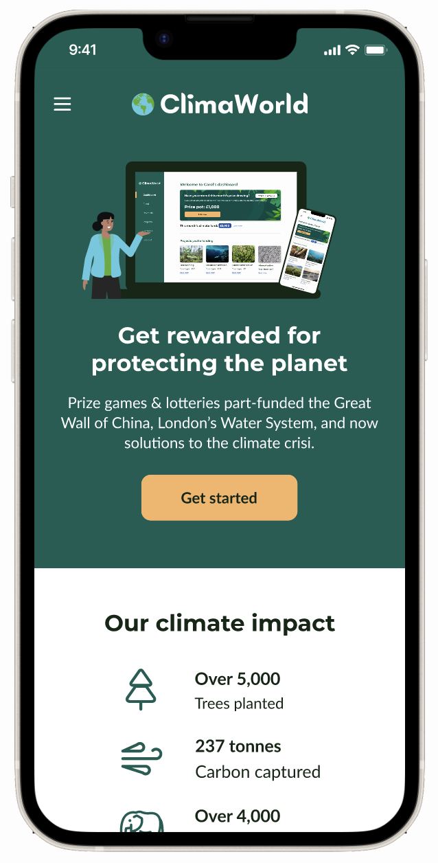
Mobile Design
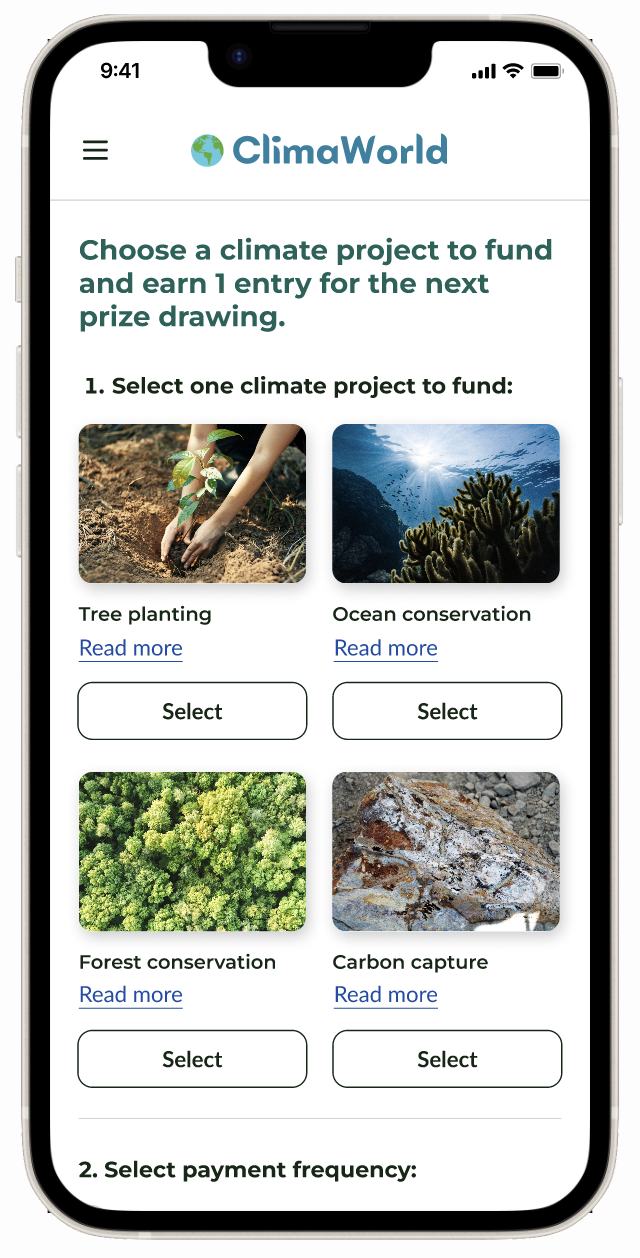
Ideally, the product should have been designed with a mobile-first approach because approximately 54% of web traffic comes from mobile devices. I pushed for mobile but the client wanted to focus on desktop instead. I decided to create some mobile screens anyway to show how mobile users would view the site.
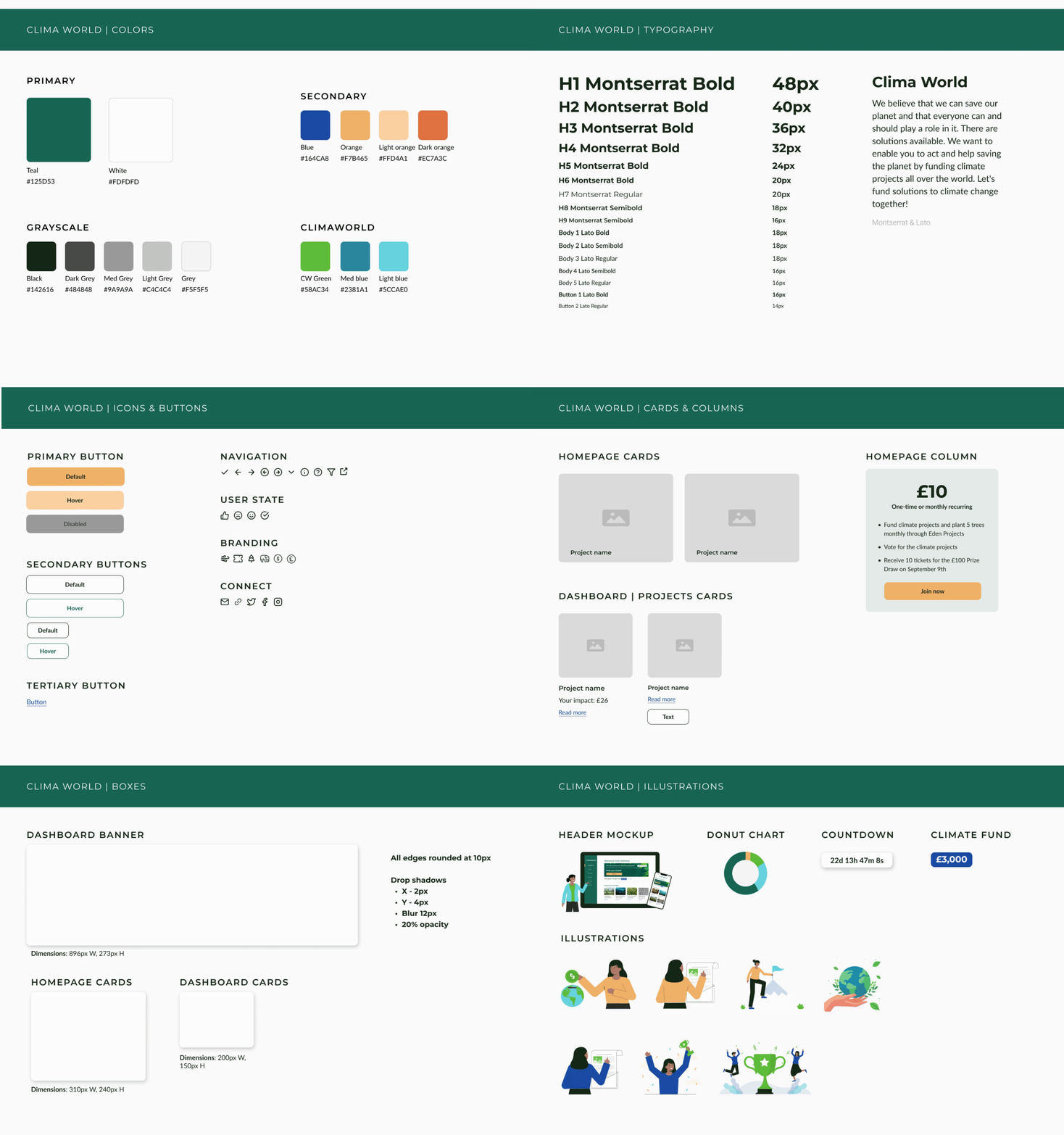
DEV HANDOFFStyle Guide
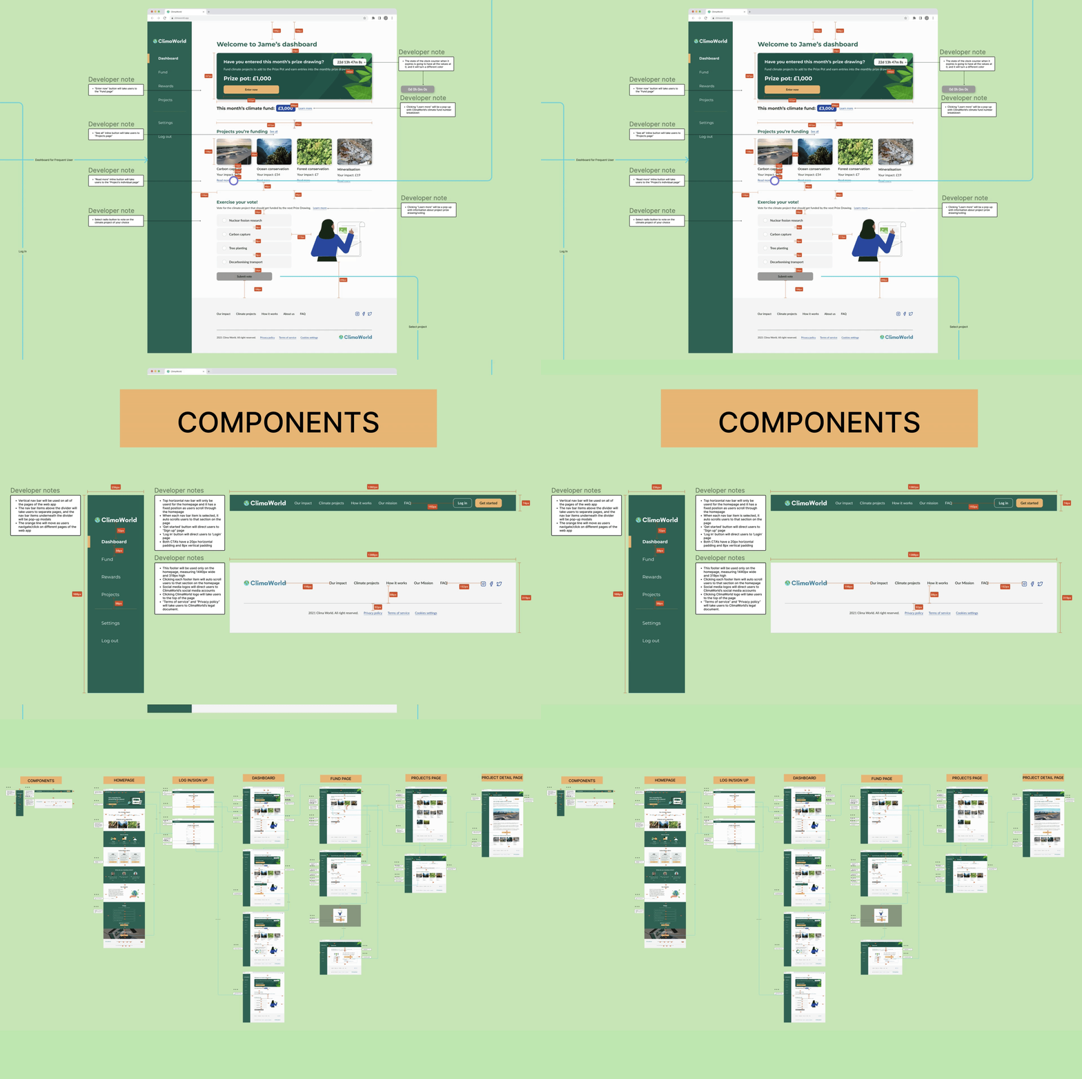
Specs & Annotations
Next Steps
Test prototype out on real users
I would like to have real users complete tasks, like funding a project or checking their entries, within our prototype to see how quickly they complete them and if they encounter any obstacles along the way.
Focus on mobile-first design
The ideal way to approach this project would’ve been to design for mobile users first. If I had a chance to start over, I would first conduct user interviews and gather qualitative data to find out what users what like to see in a ClimaWorld mobile app. Then I would begin to design ClimaWorld’s product based on user feedback instead of just diving first into desktop design.
Learnings and Key Takeaways
Defending design decisions
I believe that designing an intuitive, user-friendly product requires making design decisions backed by data, usability testing, and UX best practices. Standing up to stakeholders and defending correct design decisions is vital to ensuring a good user experience. Although I couldn’t persuade the stakeholders in this project, it’s always important to voice concerns about UX best practices.
More Projects
CoralTech
Power to the Brand (YCW22)
