Power to the Brand
MY ROLE - SOLE UX/UI DESIGNERDURATION - 4 WEEKSPower to the Brand is a Y-Combinator backed B2B marketing and distribution as a service startup based in Singapore.
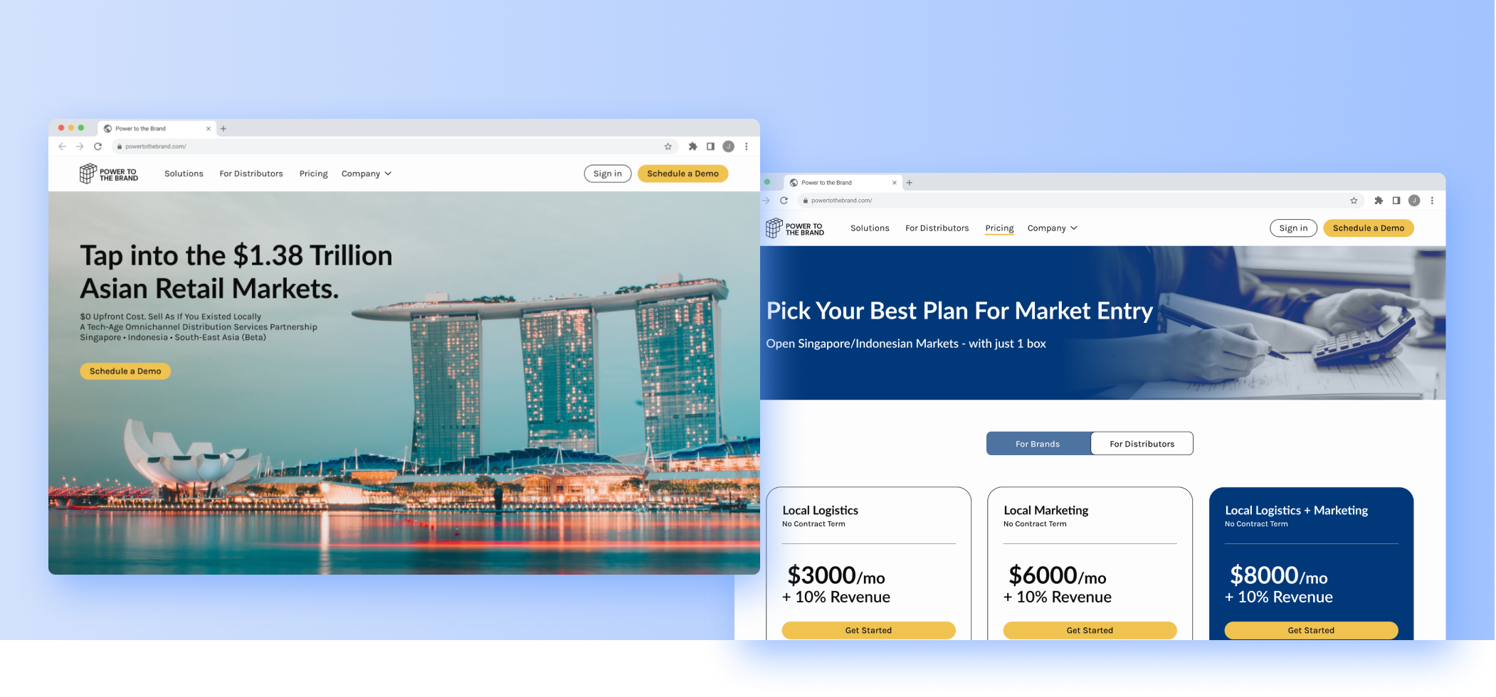
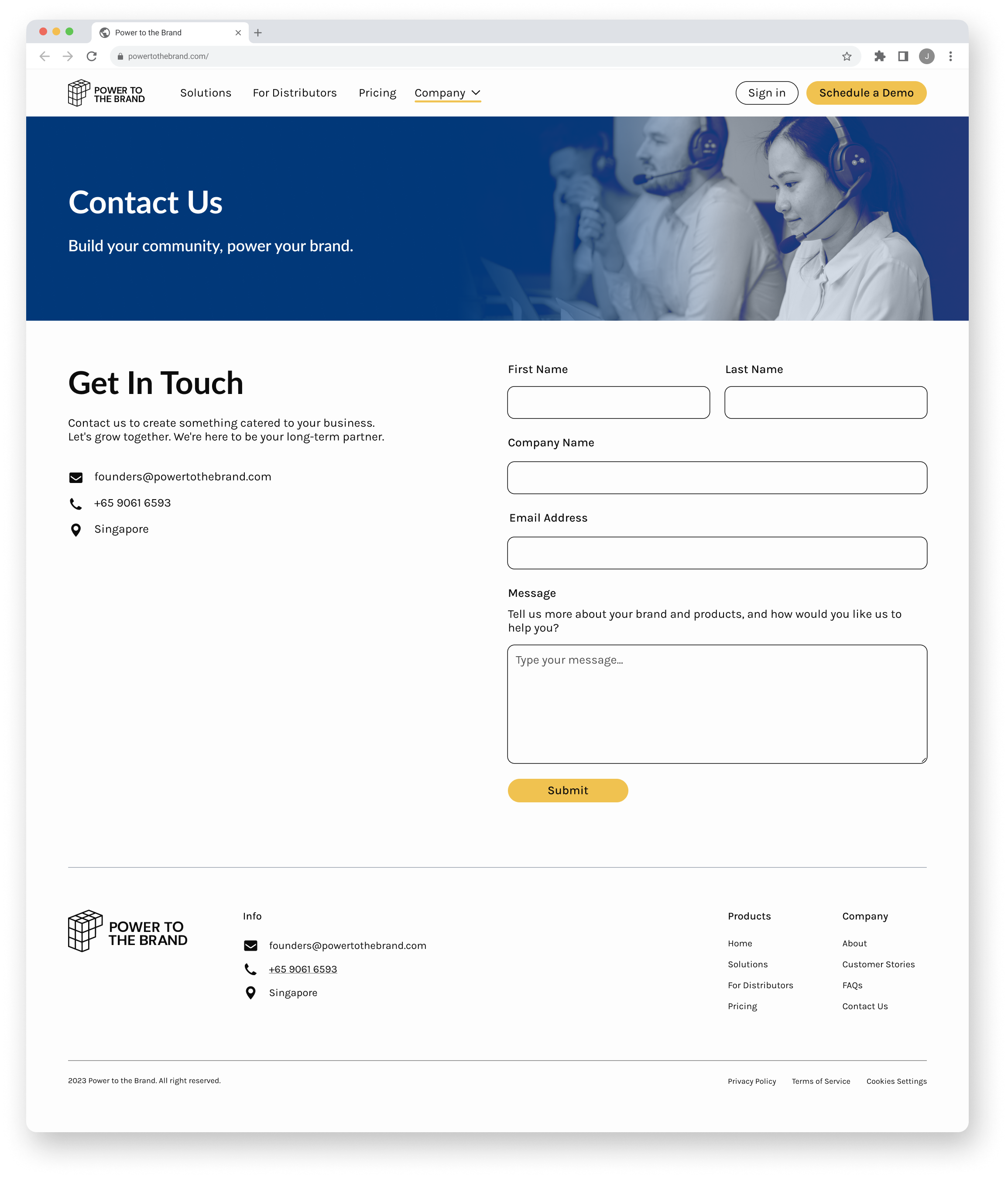
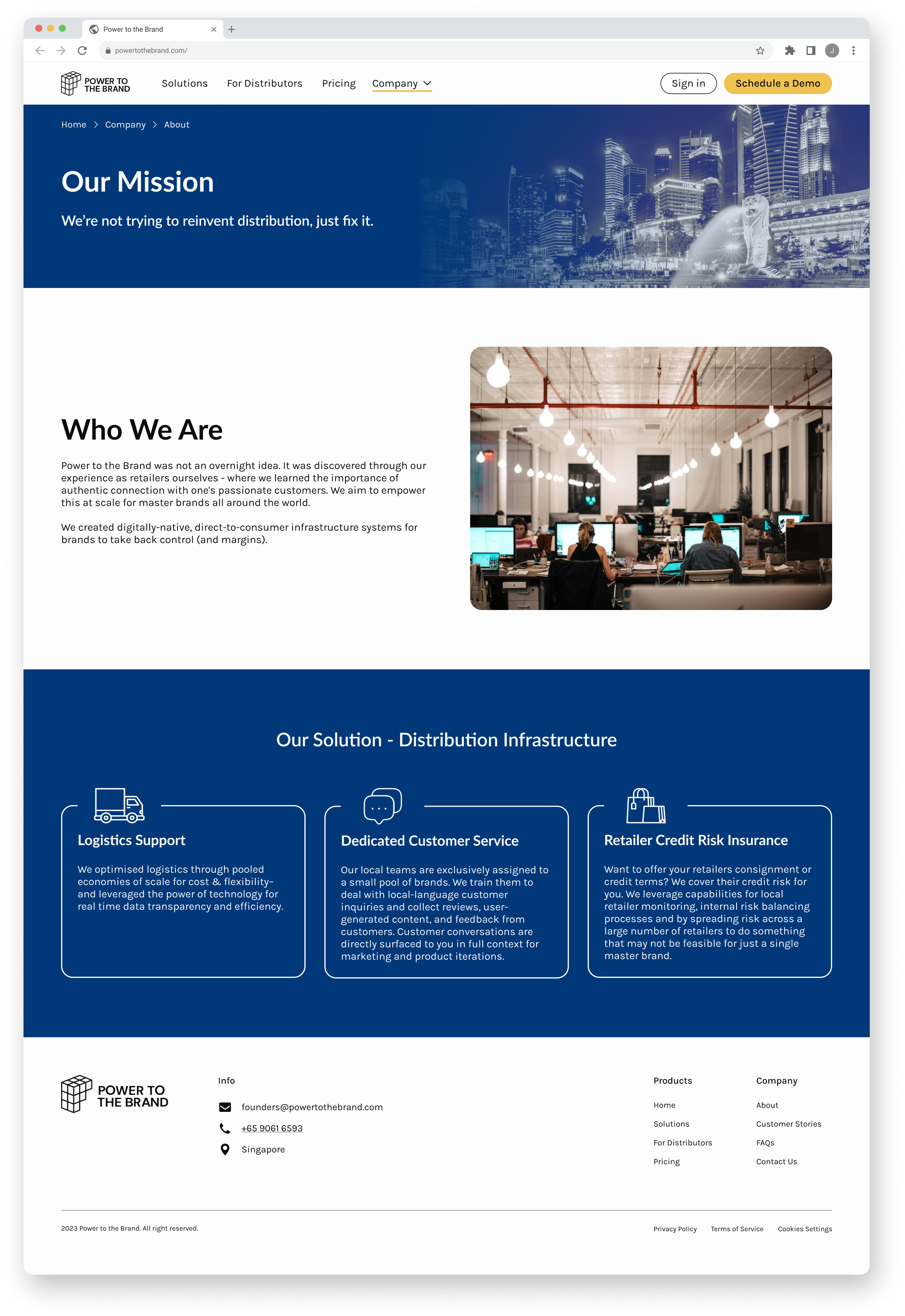
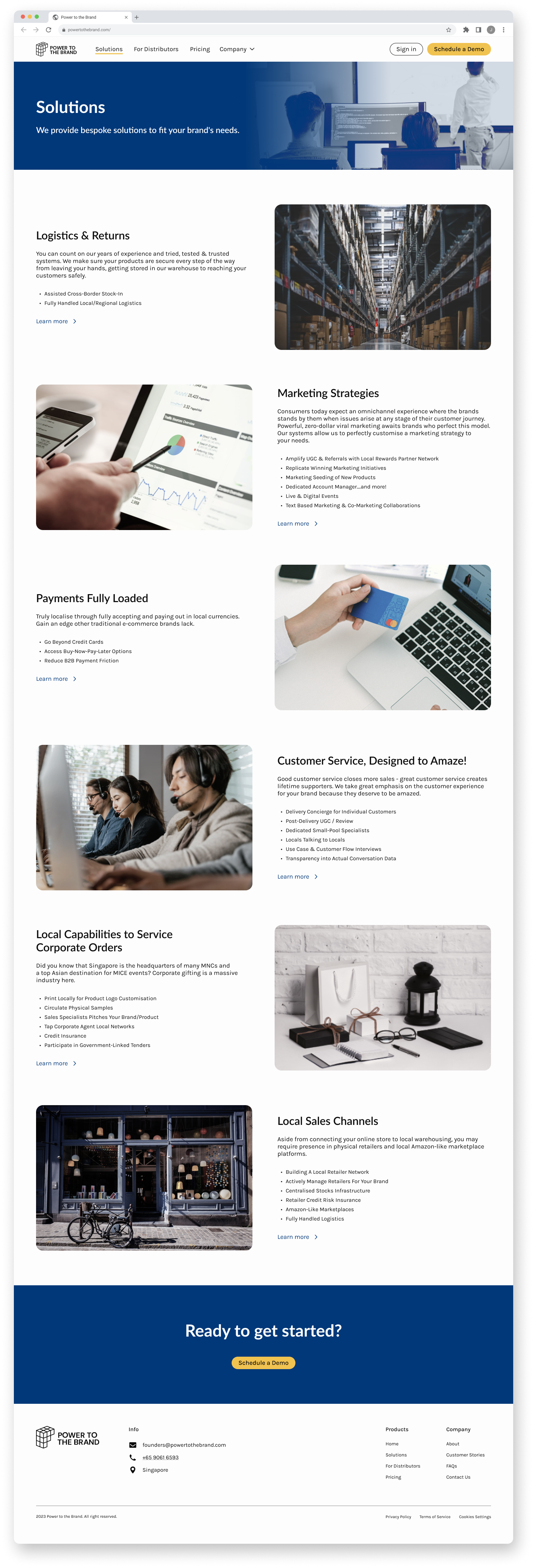
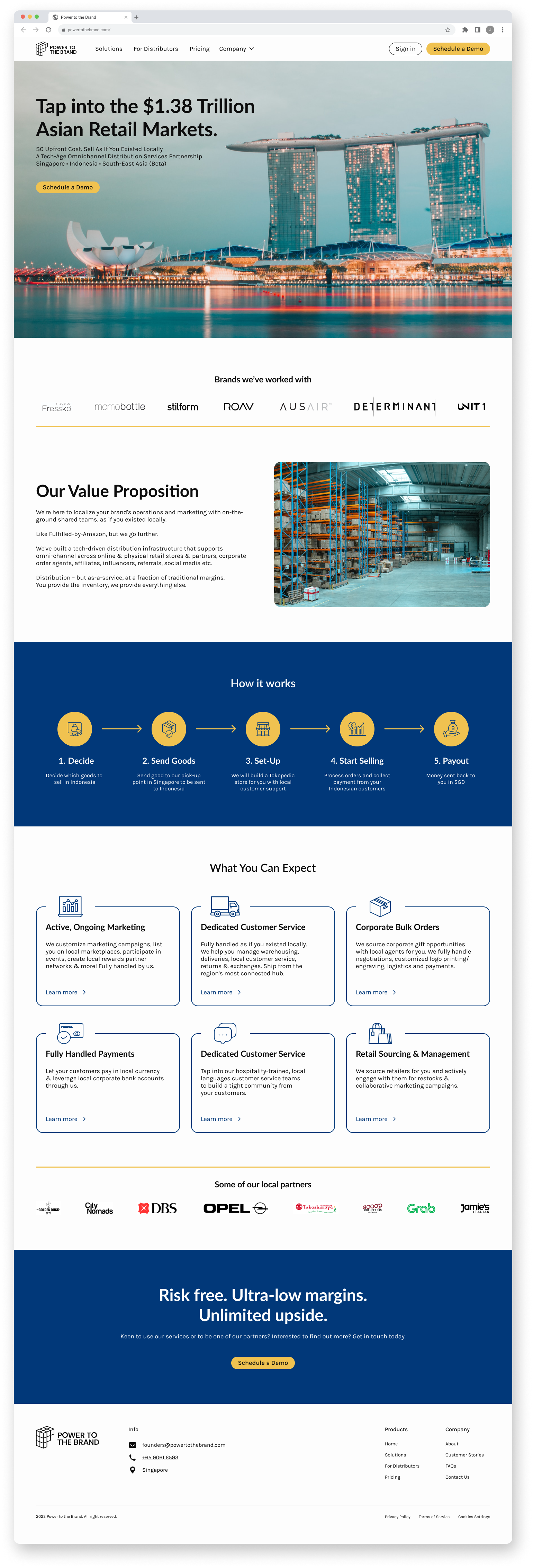
I completed a redesign of their company’s website. I fixed usability errors and improved navigation leading to a more intuitive, cohesive, and user-friendly website.
PROBLEM SPACEWhat disrupts the user experience for new and existing customers?
How Power to the Brand works is that consumer brands from outside Asia send over their goods, and the Power to the Brand team handles marketing, takes payments, and delivers locally in Southeast Asia. Our client, Power to the Brand's CEO, needed help redesigning his company’s current website in order to attract more brands and increase site traffic.
Since the site was built without a UX designer on the team, there were numerous usability issues that needed to be addressed. My job was to enhance the user experience for customers by creating a website that’s easy to navigate, free from any usability issues, and showcases a more modern and visually appealing look and feel.
HEURISTIC EVALUATIONWhat usability errors can I identify?
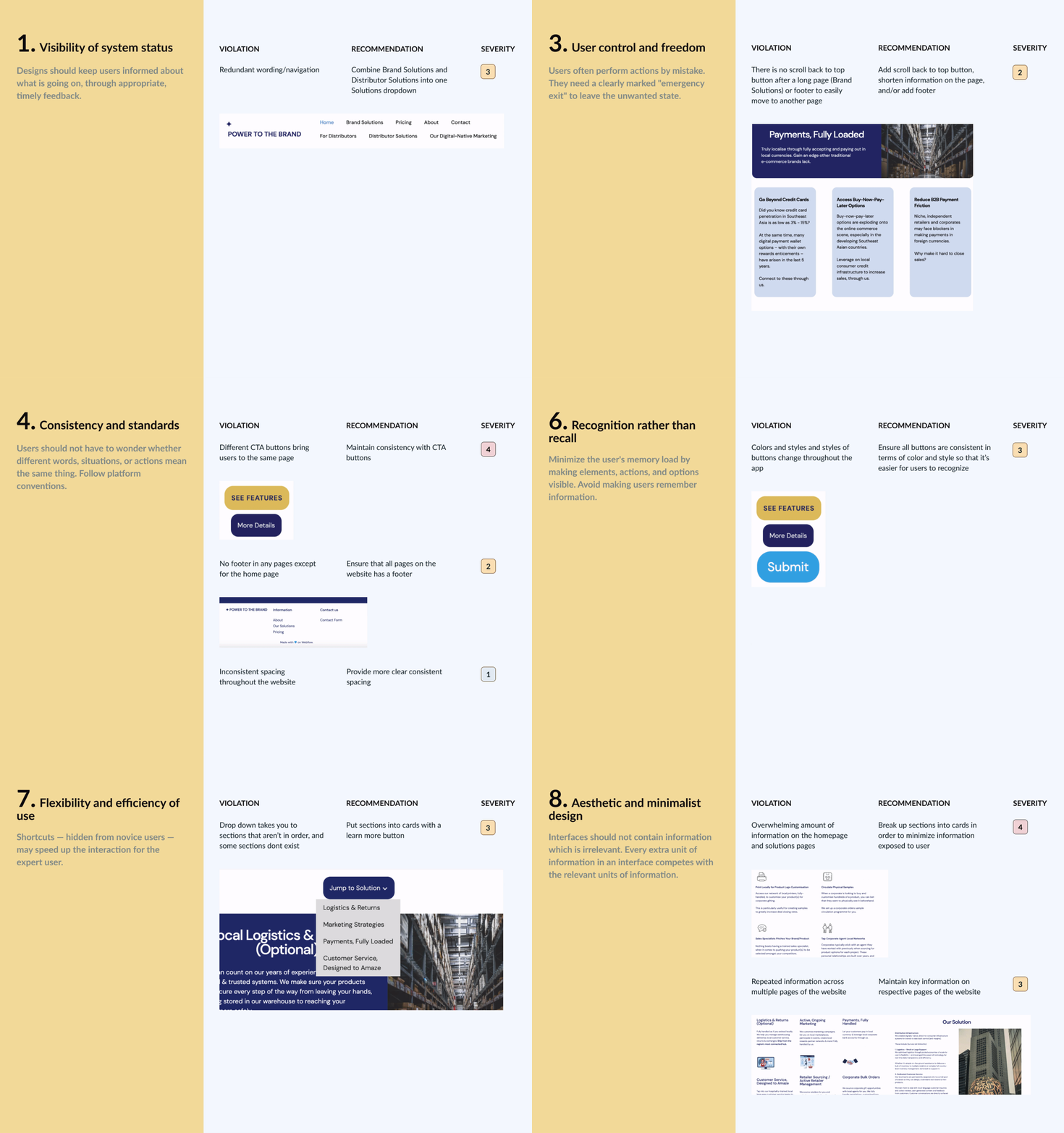
I completed a heuristic evaluation of Power to the Brand’s desktop screens using Nielsen's 10 usability heuristics. This made redesigning the website much easier since I noted down all usability errors and made suggestions on how to fix them. I then compiled my findings into a presentation for the client.
COMPETITIVE ANALYSISWhat were other companies doing right?
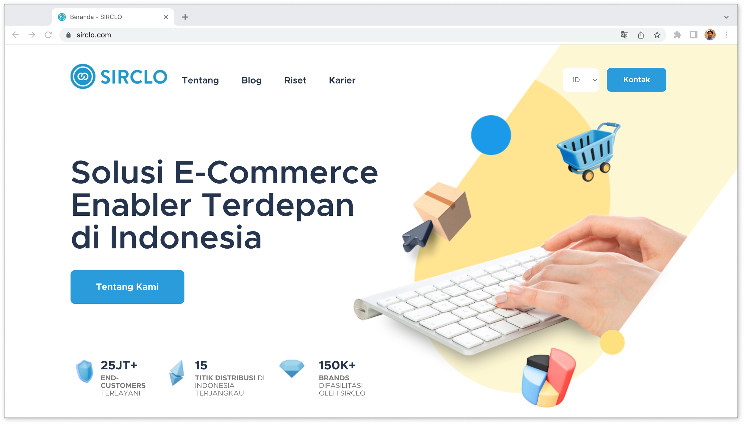
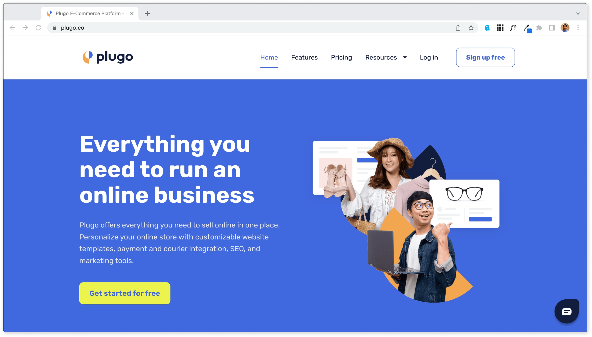
I led a competitive analysis of the client’s two direct competitors, Sirclo and Plugo, which were both e-commerce distribution companies based in Southeast Asia. I found that it’s important to have a top nav bar that has a visual indication of what page you’re on, alternating cards with easy-to-digest information, and clear CTA buttons that stand out visually.
INSIGHTSUsers were hesitant to use the website because the design was unreliable.
Users were confused when links and buttons would take them to the wrong sections
Users felt overwhelmed when the site had information overload and repeated information across multiple pages
Users were hesitant to use the site when the UI showed a lack of consistency
USER FLOWSHow might we make navigating Power to the Brand’s website easier for users?
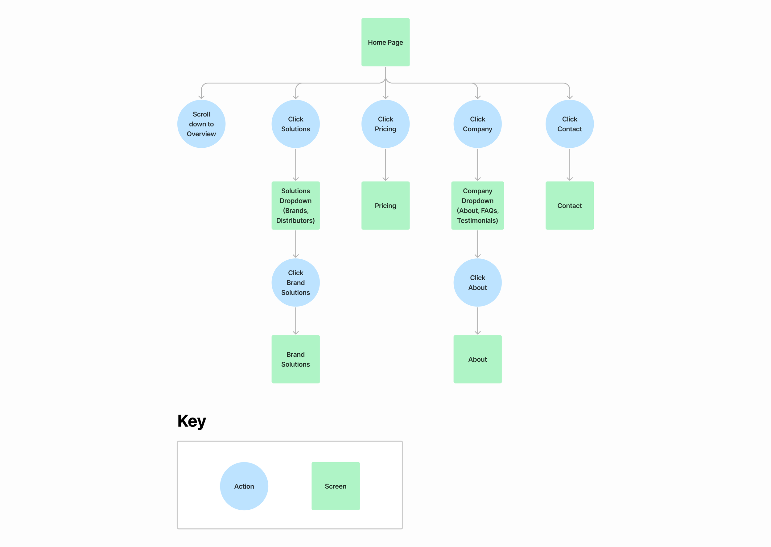
In order to ensure easy navigation throughout the site, I mapped out some user flows. I made them simple and intuitive so that users could get to their end goal seamlessly and efficiently.
ITERATIONSTop Navigation
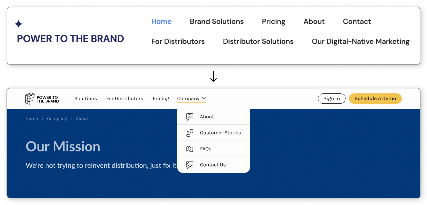
Consolidated top nav bar into one row. Added CTAs. Built a drop-down menu that conserves screen space.
Pricing
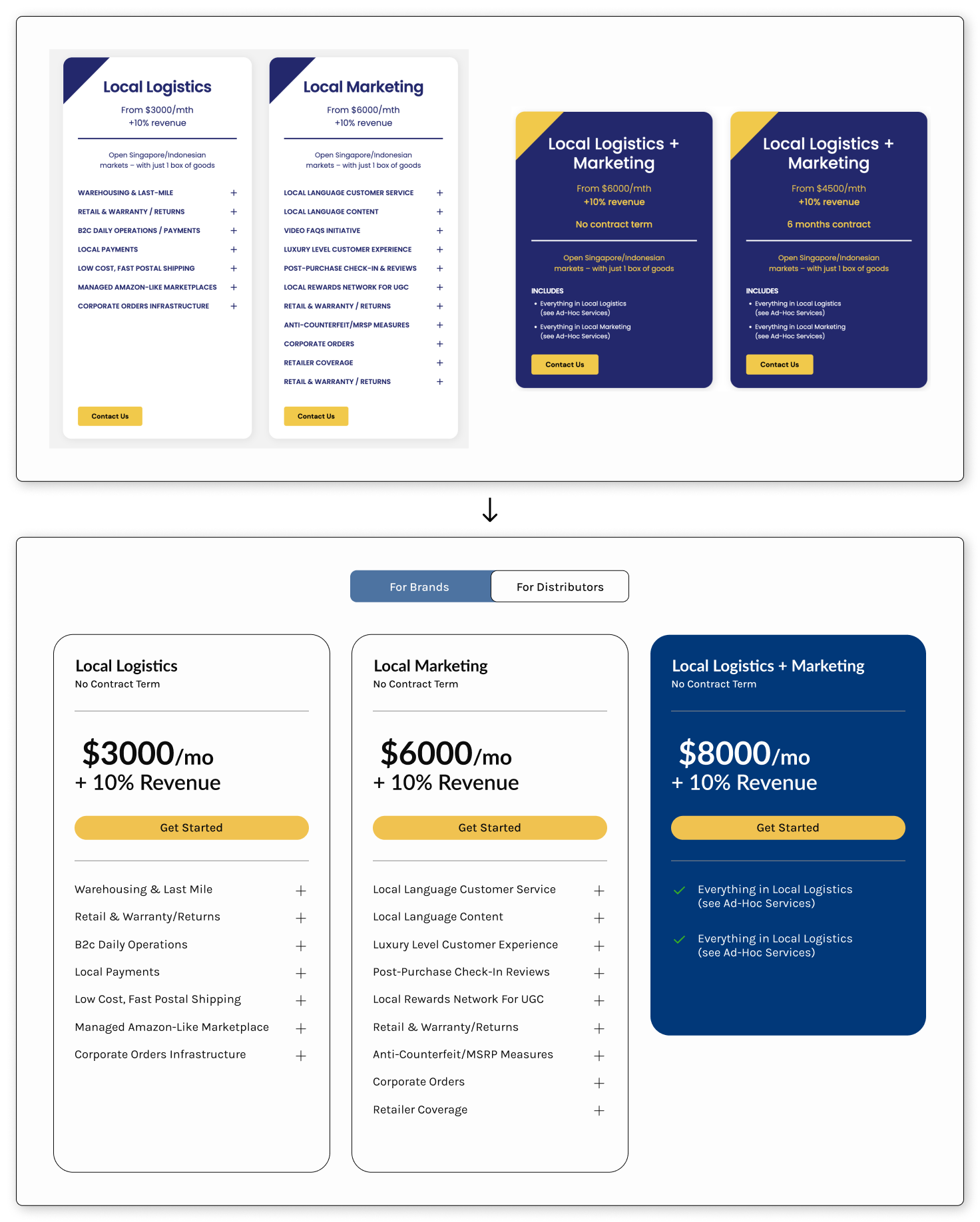
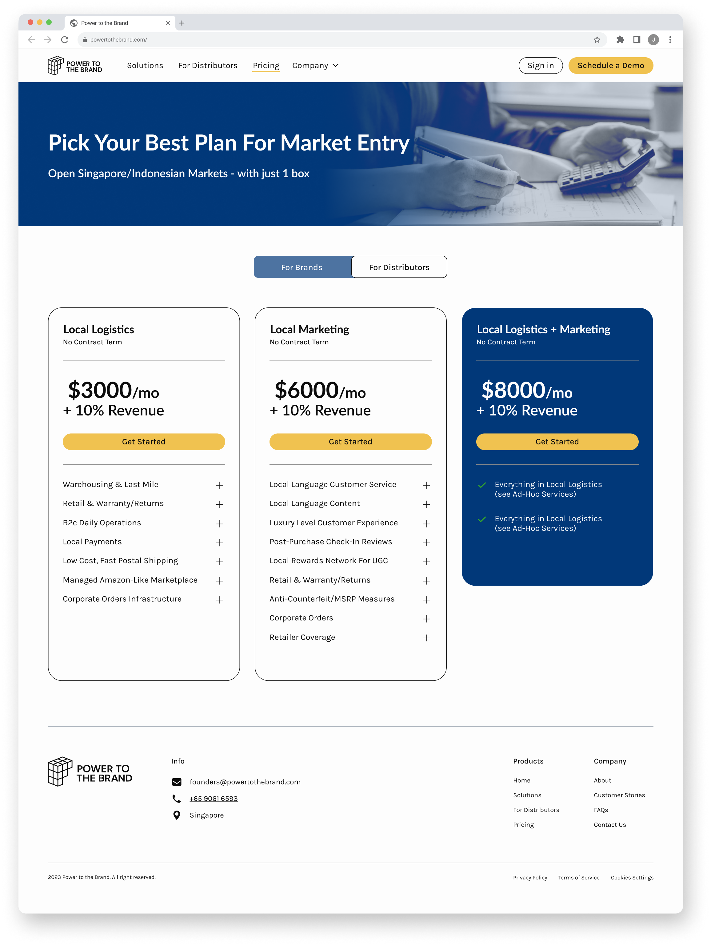
Client wanted to show different pricing plans for brands and for distributors, grouped the plans and created tabbed navigation to alternate between the two categories of pricing plans. Made CTA bigger and moved it to the top to increase visibility. Increased pricing font to make it easier for users to read.
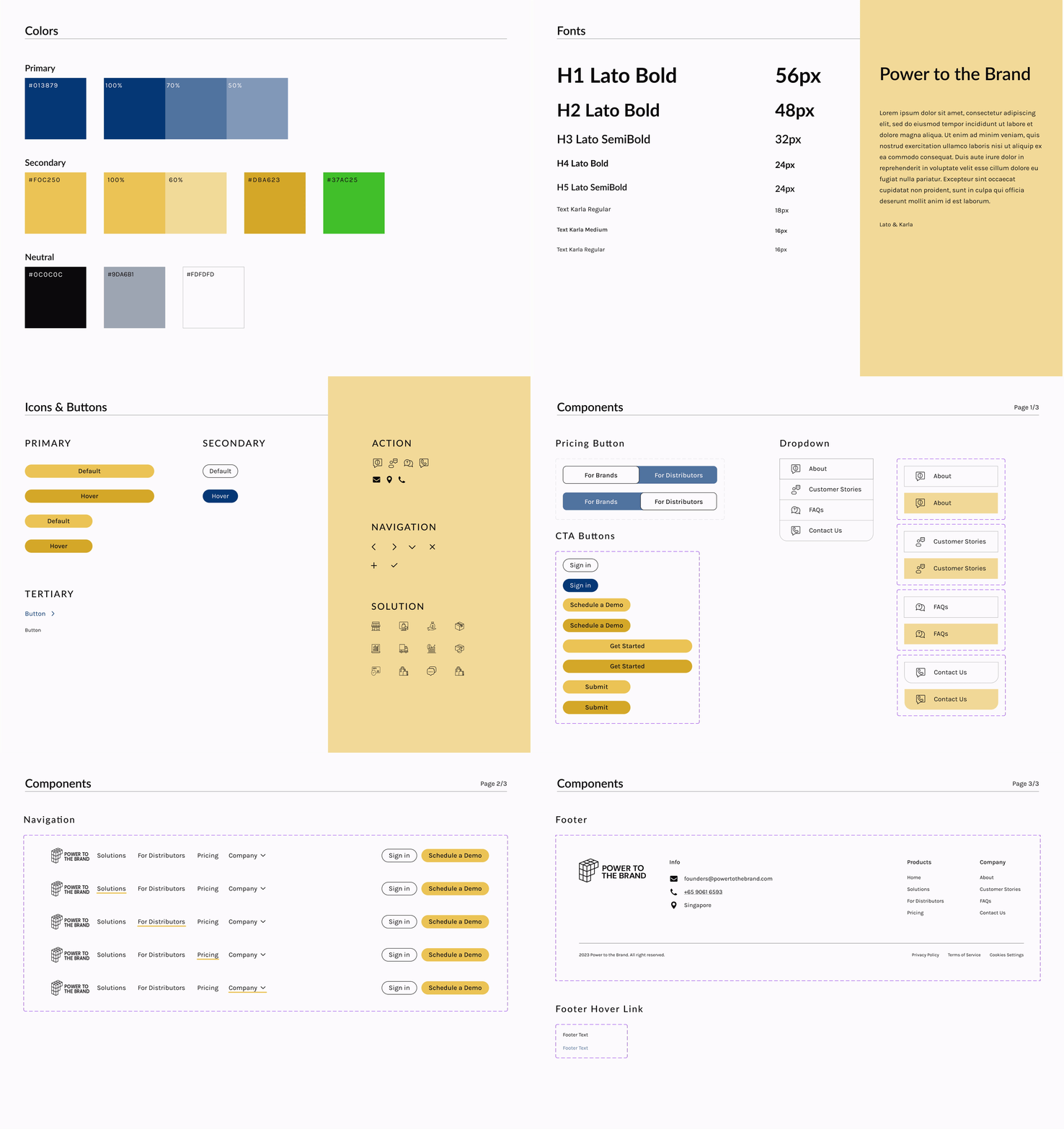
FINAL DESIGNSDEV HANDOFFStyle Guide
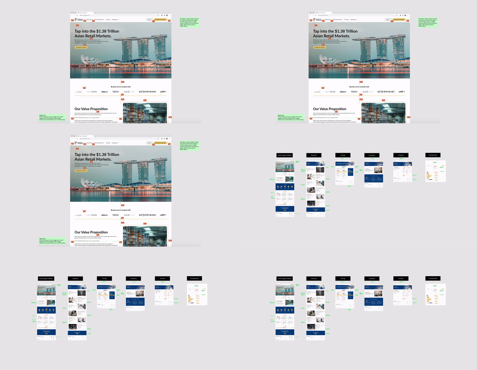
Specs & Annotations
Next Steps
User testing
I would want to get user feedback by conducting usability tests. Ideally, the new website would lead to an increase in current customer retention and attract new customers. The redesigned site would be easy and intuitive for users to find the company mission/value propositions, see pricing, and book a demo.
Build out schedule a demo
The scope of the project didn’t include building out the process of how customers could schedule a demo with the Power to the Brand sales team. If given the opportunity, I would like to design that flow and show how users would be able to contact the sales team and book a demo on a calendar.
Learnings and Key Takeaways
International design
Designing for an international audience is complex and brings some interesting design concerns. Because the company is based in Singapore, I worked with the client to understand what users and customers in Singapore wanted. I also took into consideration language barriers and different currency rates. Overall, I learned a lot about designing for a more global user base.
More Projects
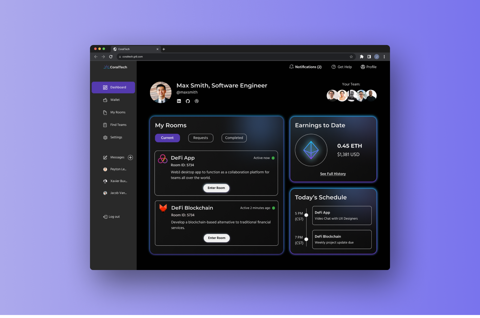
CoralTech
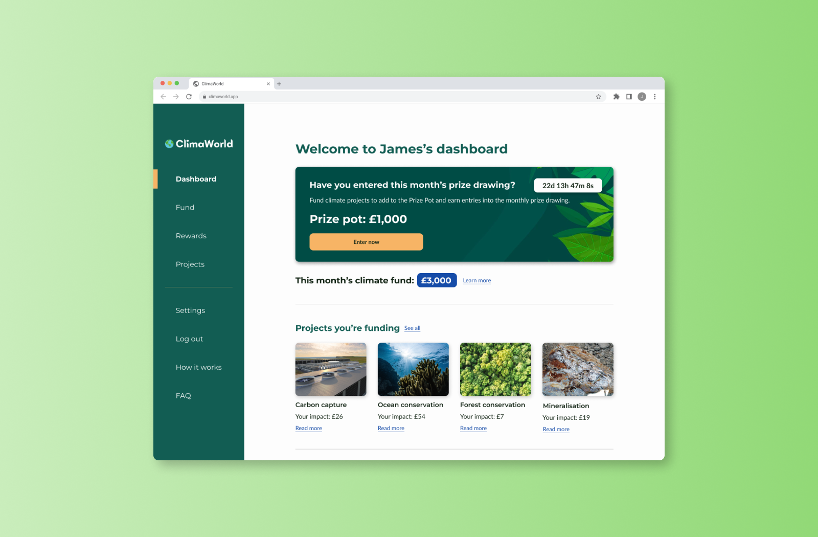
ClimaWorld
